Saturday, December 30, 2006

A LITTLE CLOSER

A little closer to what I wanted:

Thursday, December 28, 2006

WHO DOESN'T LIKE A QUICKIE?

A really quick drawing I did in-between day jorb and bruising my fingertips at Suave sexxions:


Still making business with #7s. Fizzy jizzums olde-time formula.

Tuesday, December 26, 2006

VERSION 1.0

Here's a first stab at a Carl pinup for the Marcos.


Now it's time to drink and watch Looney Tunes on dvd.

ANOTHER

And here's a new version of another drawing. The last one was posted while I was drunk off both my asses. This one is posted the sobers. Also done fool 7s.

SCAN DETAIL

Here's the latest version of a long-promised drawing. At least, the part that fit on the scanner.


Done entirely in #7.

Sunday, December 24, 2006

AND THE FULLS

The image was too big to scan, so I took a quick snapshot of the full version.


It wasn't intentional, at all, but I still hope I can't be sued for crappy stylistic swiping. Either way, I need to fix that left boob. Or growth under her left armpit. Whatever that is. So, I'll attempt a version 3.

I was going to do more work today, but it turns out I'm starting Holidays this afternoon. Pain always seems more enjoyable when it lasts longer.

WHOO-HOO

You go to bed thinking, "It's Christmas, why should anything go right?" Then you get all up ons blogger and it works. Here's version 2.0 of that drawing from three posts down:

Monday, December 18, 2006

ELEVENTEENTH AND LIBRARY

Like the rest of the world, I've been enjoying making stops to Paul Pope's blog. I was taking a break from drawing on Saturday and read a post that broke my heart. The post seems to be lost now, so I can pretend I just imagined it. I guess. There should be a Yes song about how imagining a broken heart is worse than owning one. Duece worse than a lonely heart.

Anyway, I was working on pages 7 and 8 and starting to get the back of my head ready for pages 9ups, thinking about revisiting my tiny photo library for set reference. I was still coming off that pride high I felt when I used the previous reference shots. I really felt like I had used them right. Like olde Eddie Campbell in From Hell. You get the stuff you need and discard the shit you don't. And you keep it loose. No one likes the slavish.

Well, Pope's post struck me in the chords. He wrote about using photo reference for things you've never seen (the Taj Mahal was the case that he gave us) and you evoke the atmosphere of everything else from memory. And he included a lovely image of a friend's apartment he evoked for a Spider-Man story. And, boy, did he evoke the shit out of that apartment. What hurt was that Pope wrote about the cartoonist's obligation to not depict the world as it is, but rather as he sees it. Slam. That's the gut shot. That's the shot that hits you where you live. That's the can of worms in the kitchen sink. Kaboodle.

So, here I am, drawing my own neighborhood from photos. Reading his post, it sucked the stomach right out of my bile.

After finishing that day's pages, I went over to Marcos' party and shared my existential dilemna with him amidst the fragrant scent of his studio. I wasn't sure what that smell was, but I realized it was something burning. Turned out to be sage.

Marcos said that what Pope was saying was fine, but you get yourself some reference and you let it collect in your head. Pretty soon, you've got yourself a mental library of so many doorways, window sills and fire hydrants. And drawing these things as they are, puts them a little deeper in your head than just observing them. Godot.

Finished page 11. here's the second panel:


And I can feel that library starting to build. Grab a fence from here, another one from there. This is where the roof is in relation to the top row of windows. This is how wide the sidewalks are. This is how the telephone lines cross. Don't forget the stop signs on the street signs. City.

Sunday, December 17, 2006

FIRST AND TEN

Pencils for page ten are done. I find myself getting looser and tighter at the same time. Write that down. Also write down "Golden showers of golden nog." While the abstraction flowed last night, we found a few lines that would seal it on a new Suave album. There might also some stuff about ferrets.


Instead of hitting page 11, I'm going to conclude biznaz and then move onto a couple other drawings for alterior purposes.

NEIN!

Well, some company this morning from the long-missed Carrie and then my own devout laziness put me off work for a bit this Sunday, but I finally put the page nine pencils to bed. Here's the bottom tier of panels:


I'm halfway done with the pencils.

Now onto Page 10.

Saturday, December 16, 2006

THE FRUIT THAT ATE ITSELF

Page 8 pencils done. Here's the bottom tier of panels:


I did the panel borders for page nine as well, so I can go right into drawing tomorrow morning.

It's going to be interesting to see all this inked. 10 pages to go.

Now, it's off to Marcos', where he's making a ham.

Thursday, December 14, 2006

RELATIVE TURKEY

My cousin Aubrey is finishing up her student teaching this semester. As part of her curriculum, she had to engage the kids in a community service project. So, she organised a a walkathon that delivered turkeys and food to less-fortunate families in the area for every lap around a track her students completed for Thanksgiving. It was a nice way of combining physical fitness with social resposibility and it gave the kids a sense of accomplishment. And it was apparently very successful.

So, she needs to include this project in her portfolio when she's scouring the countryside for a job and asked me to provide a cover image for her report. Just a quick drawing to spice the thing up.

So, here's a turkey getting its strut on:


I hope it's something she can use.

Monday, December 11, 2006

BROOKLYN/JERSEY CITY DRAWING PARTNERSHIP

or Now That's What I Call Service! Vol. 7

I mentioned yesterday, somewhere in those ramblings, that Jude had all of our collaborative bar drawings. Well, this morning she gave me a couple (and then yelled at me). Here they are for your Eddy Vacations. I'm sure you can click to enbiggen:


This first one is a Jude solo piece she did while I was having a cigarette. She's like my private Eddie Campbell. It screams the guy. I love the line of his arm. That's a gorgeous line.

Things got less life-drawingy when we doodled together though:


I should note that these were all done with a single ballpoint pen on lined notebook paper. Jude's cat is the standout, here. But I'm also fond of my nervous McGruff.


Here's a wild bar scene:


Olive Oyl is a sad ballerina, and Popeye is the artisic director oblivious to his suroundings. I love the Ruebensesque woman on the left. In the back, I'm not appologizing for the woman I drew so badly we made her Santa Claus.

Speaking of Santa Claus, I'm writing this just two weeks before his birthday, or something. Here's this year's Broughan family Christmas card:


I was a bit surprised to learn that our little doodle would be greeting folks in New Zealand this season, but I think it's pretty cool for yule.

Hopefully, I'll have more of these to share as we do more. I need to remember to get some pens and paper, so we don't keep wasting hers...

Sunday, December 10, 2006

DRINKING, DRAWING, DEDINI AND DITKO

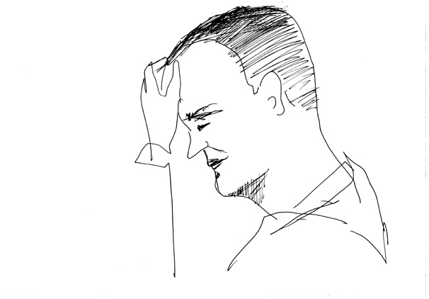
Computer! I've been doing a lot of work on the computer end of Kaiju Jugoruma when I haven't been busting my ass at the day job. Some of the panels I did were so over-worked with pencil (from 8Hs to non-repro blue to non-repro violet) that no amounnt of scanning magics could hide the build up. There were also a couple other things that needed to be done in the computer like replacing handwritten signage with typesetting and dropping this advertisement:


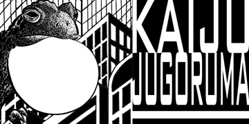
into the action. The fellow on the left is Kaiju Jugoruma, the giant nuclear bullfrog. He's coming to a movie theatre in the comic soon. Or is he? I killed a brush making him. Then I killed it some more. By the end of the drawing, I was doing pointilism with a three-pronged #4.

Another thing I've been doing is reading a chapter a night of the first Dr. Strange Marvel Masterwork, given to me for my birthday. Ditko gets smoother with his brush line in later chapters, but it's a lot of fun looking at his earlier, slapped-on lines. It's a strange (eh-hem) mix of delicate thick-thin brushwork, rough textures, fat, broad lines and big, impressionistic, goopy blacks. It's fun stuff.

Bu the thing that strikes me the most is Ditko's compositions. Backgrounds are dropped out entirely or suggested with a minimum of details. In the foreground of one panel, the dash-mark-textured Ancient One is talking to a Baron Mordo dressed in a tunic seemingly cut from stone, while Dr. Strange looks on from deep in the backgound. An archway sits in the middle distance, placing Strange in a different room, but the archway is completely unanchored by anything resembling a wall or ceiling. The colorist accentuates the separation of space by coloring the negative space outside the arch differently than the negative space inside, and you have to consider the image for a moment longer to see that this is more of an Our Town production than a Lord of the Rings set design. When the backgrounds are more fully realised, they still maintain that impressionistic sensibility. And it's a reverse impressionism, not suggesting the dappled texture of light, but the soft edges of overlapping shadows.

Then there's his use of forced perspective to create compositional frames. It's not something unique to Ditko, especially from the time and in the genre he's working, but there is something that stands out about it. He's more likely to use figures to create these framing objects than he is to use architecture or props. It's big closeups of faces turned into frames for background figures to perform in. And their performaces are often so understated that they become secondary frames for Ditko's dynamic negative spaces. It's in these spaces where the excitement really lies. These bold, empty spaces filled with flat color. It's a focus on negative space that requires a way of seeing the world backwards from the way most people percieve it. When we look at something, we usually look AT something, and not at the space it occupies. It's a way of two-dimensionalizing perception that doesn't differentiate beween the details of something and the shape of something. That gives equal importance to what is there to what isn't there. And it's an artistic choice that works particularly well in the context of Dr. Strange, whose early battles often take place with people just standing around and whose later, more dynamic confrontations take place in realms other than the real.

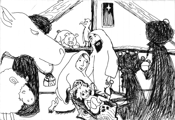
Anyway, these things seeped into my subconcious bfore I really started thinking about them. The other night, I was doing a couple drawings with Jude (she's got me doing collaborative doodles with her) and she wanted to draw something nice and Christmasy. We wound up putting a fun little nativity scene together. The first thing I drew was a big camel head in the foreground and I continued populating the scene with silouetted wise men and suggestions of manger details, all framing Jude's Joseph, Mary and baby Jesus. It's a nice doodle I can't show you (she has most of our drawings), that struck me as being awfully Ditko-esque. At least my portions. And, at least, compositionally. I refrained from throwing in any Ditko hands.

These drawings are a lot of fun to do, and they're a great way to keep you drawing while your doing something else (like drinking out at a bar, or sitting in a meeting). It's also fun to see her lovely cartoons integrated with my grotesqueries. But this last session has got my brain actively thinking about compostion instead of just letting the composition of a drawing determine itself. It's good to be forced into that way of thinking every once in a while, because it's easy to take these things for granted when you're knee deep into the next page.

Over the course of this drawing and Ditko week, I also decided to pop in the dvd included with the stunning An Orgy of Playboy's Eldon Dedini. Dedini has always been one of my favorite things in Playboy, even when I was sneaking them out of adults' hidden spaces as a kid. I was reminded of how much I enjoyed his painted gag cartoons when I got Playboy's 50 Years of the Cartoons for Christmas last year. When I heard about Fantagraphics releasing a big collection of his work, I couldn't wait for it. And it's a fabulous book.

In the dvd, Dedini talks a bit about the importance of creating a strong enough composition that can allow him to just be free and loose when he approaches the finished drawing. It's this confluence of compositional advice (some that can never be repeated enough), theory and practice that has me aching to get back to the drawing board.

I just don't give enough attention to composition when I'm drawing. I focus a lot on the direction of action and the theories of storytelling. I try to make sure all the compostional elements are there and in the right place, but I sometimes leave out the step in the thought process that holds these elements together. All too often, I look at an image of mine and revel in a line a might be fond of, but ignore the shape of the image. It's something I want to make a stronger component of my work. It's the next problem I want to have a sack of solutions for when a particular image stumps me. The sack of solutions is that place you reach into when you're confronted with a blank page and need to get certain things out of the way so you can get to the business of drawing.

So, it's back to school time. It's reinforcing the fundamentals time. It's activating the space with form, rather than mark-making, time. It's time to pump some tunes, crack a pad of bristol and think about the shape of things to come.
eXTReMe Tracker